Designer’s Guide to Flexbox and Grid
What designers need to know about these transformational layout tools.

CSS has come a long way since its introduction in 1996, but the tools we have available for layout haven’t changed much. Table layouts were incredibly too rigid, float-based layouts were basically a hack, positioning-based layouts were not adaptable, and none could handle a great deal of complexity in an efficient way. Don’t get me wrong — these methods got us really far, but they aren’t intended for complex layout purposes.
The short-comings of these old methods for layout have become even more apparent with responsive web design, in which embracing the fluidity of the Web is fundamental.
With flexbox and grid, we finally have tools intended specifically for layout that are more efficient and void of hacks necessary with previous layout methods. They unlock new possibilities to old problems, enable things that weren’t possible before, and solve real problems we face with responsive web design.
Flexbox
Flexbox, aka CSS flexible boxes, is a new layout method that gives us alignment control that no other CSS method can produce. It excels at ‘micro layout’: the ability to align, order, and distribute space among items in a container, or alter an element’s width or height to best fill the available space.
Improved Wrapping
In Responsive Web Design, the width available varies as the viewport width changes sizes. This can lead to unintended content wrapping, especially when the content is longer than designed for, or the content’s container is too narrow. We’ve probably all seen before: the design accounts for the ‘ideal’ content length, but as soon as it’s implemented and real content is added, the content wraps to the next line because there wasn’t enough space or breaks out of its container. Both are not ideal, and can cause layouts to break.
The problem is not being sure the available space will always be large enough to accommodate content that can vary in length. Traditionally, we’ve used CSS Media Queries to adjust layout at specific breakpoints to mitigate issues with content wrapping. But Media Queries don’t take into account the length of the content itself — they respond to an explicit width or height. This often results in an excessive amount of media queries to control a specific piece of content at explicit breakpoints.

Flexbox solves this problem by enabling us to take advantage of the space available and then wrap content when it’s not. This auto-adjust behavior is not only convenient, but improves maintainability because we don’t have to rely on breakpoint to manually adjust the styling. The example above demonstrates this behavior: display the location label adjacent to the title if enough space is available, and align the location label to the left below the title if sufficient space isn’t available.
Traditional methods like floating would have resulted in the location label remaining right-aligned on smaller viewports, which is less than ideal. You could correct this by floating the label to the left at a specific breakpoint. The problem with this approach is now you are dependent on a breakpoint to change the styling of your content, which can vary in length.
Improved Spacing & Alignment
When it comes to spacing and alignment in CSS, we’ve had to get clever to accomplish anything that wasn’t the default behavior. Even effects that seem trivial can be tricky in CSS, like vertical alignment or evenly dividing space amongst items, must rely on workarounds or hacks. Some things are downright impossible to achieve.
Flexbox solves this by enabling the distribution of space between an unknown number of items within an area of unknown width or height, and align items on the X or Y axis. It works much like how design tools such as Sketch or Illustrator can control spacing and alignment, enabling the control we’d expect on the Web.
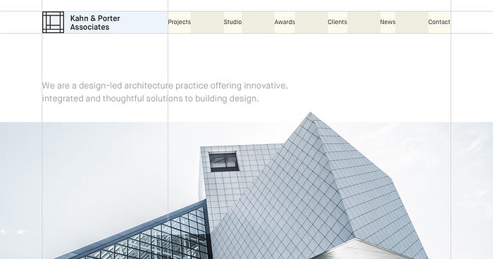
A great example of this control can be seen above: navigation items are evenly distributed, vertically centered, and the first and last item are flush to the edge of the navigation container. This would have been impossible using traditional methods such as applying inline block to items, or relying on table layout.
Source Order
Source order refers to the order in which elements are displayed on the page based on where they appear in the HTML. By default, elements will display from top to bottom and left to right by default — their width being determined by their display property.
The natural source order of the document should guide you when thinking about how your design will adapt to various viewport widths, but there are times when it’s useful to modify it in order to rearrange items. The only way to do this prior to flexbox was to hide the element and show another, resulting in duplicate HTML, or to rely on absolute positioning, which doesn’t always work when content can vary in size. With flexbox, you can simply modify the order of flex items without the need to modify the underlying HTML structure.
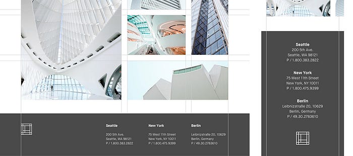
The example above demonstrates ordering in Flexbox: we display the logo on the left side of the footer, which is consistent with the header. On small viewports, we display the locations before the logo. This reordering makes sense because the locations are more important in this context.
Grid Layout
CSS grid layout is a two-dimensional layout system created specifically for the Web. It gives us the ability to divide the page into regions which can each be further defined in terms of size, position, and layer, resulting in an incredibly powerful native framework.
Fit for Purpose
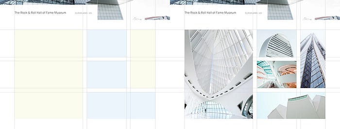
CSS has never had a true fit for purpose layout tool, so we’ve had to get pretty inventive with how we can apply a grid to our work. Grid frameworks have emerged to fill this need, but not without introducing their own problems. Many of the most popular grid frameworks require layout definition in the markup, which can lead to code bloat, maintainability issues, and blurs the separation of document structure and presentation.
With grid, we no longer need a grid framework—it’s a native framework baked right into CSS. It allows us to define layout in CSS in an intuitive way, all the while embracing the default fluidity of the Web. The capabilities of this new layout tool are endless, and it enables us to accomplish layouts that were only possible with Javascript before its arrival.
Next-Generation Web Layouts
When it comes to layout, we’ve been stuck in a rut for quite a while. Established patterns and the limitations of previous layout tools in CSS have led us down the path of layout homogeneity in the past. You don’t have to go far on the Web to spot it: header, main content, sidebar, footer.
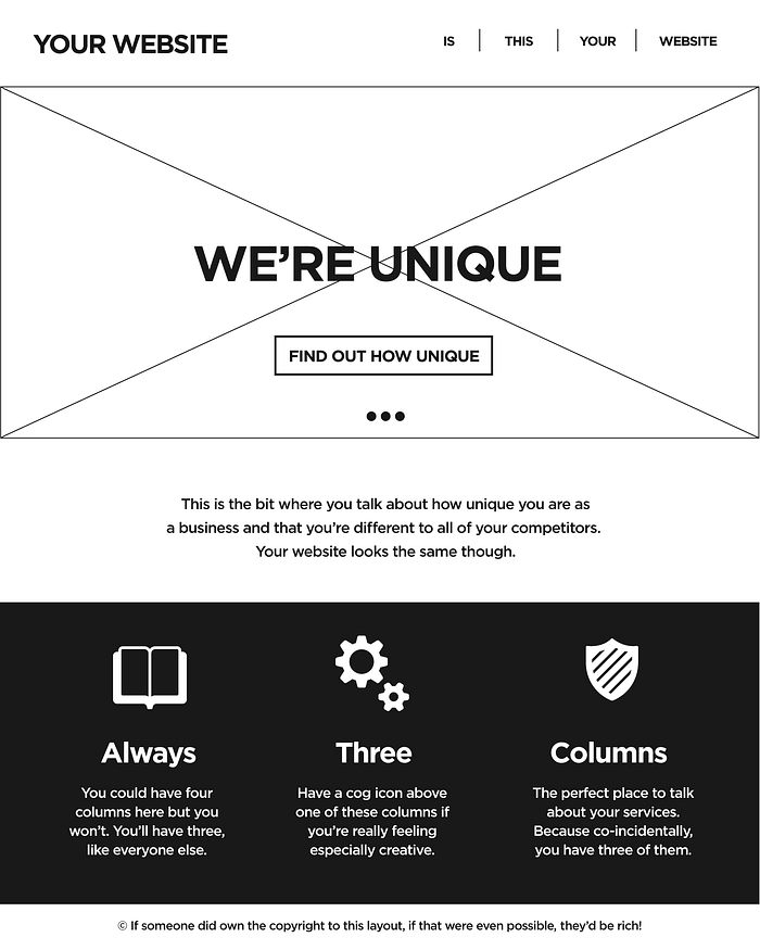
The arrival of responsive web design has initiated some new ideas for page layout, and with it some good patterns are beginning to emerge: ditch the sidebar, simplify the design, and focus on the content. But we are also seeing patterns emerge that have become so ubiquitous that we’re hearing the exclamation that “all websites look the same”.
Grid layout will enable us to exit the layout rut we’ve been in and give us the tools we need to build the next-generation layouts. We can finally build around the content instead of forcing it into generic design patterns that can be found on every other responsive website.
A Word of Caution
It’s important to note that not all browsers support flexbox and grid features. We must take into consideration who our audience is for each project and determine if the majority of users will benefit from these more advanced features, while providing a sensible fallback for non-supporting browsers. It’s perfectly acceptable to provide users in legacy browsers with a simplified version of your UI, and enhancing it for users in newer browsers.
There’s More. A lot more.
We’ve only scratched the surface of what flexbox and grid can do. Luckily, there’s lots of great documentation available that touch on the capabilities of these new layout tools. Here’s some of my favorites:
Flexbox
Grid
Anyone that has been building for the Web is painfully aware of various limitations when it comes to layout in CSS. Often times, this required compromising the design so that it works as expected in development, or worse, relying on Javascript to implement the behavior we needed.
The arrival of flexbox and grid layout signal a new era of layout on the Web. We must adopt a new mindset when it comes to layout in order to not be limited by the habits, drawbacks and hacks of the past. Let’s embrace these new tools and renew our exploration for what’s possible with layout on the Web.
